.png?width=189&height=505&name=Vector%20(2).png)
.png?width=265&height=582&name=Vector%20(3).png)


.png?width=286&height=582&name=Vector%20(7).png)

 Copy link
From 4th November, when you log into the Platform you will notice some key improvements to the user interface to enhance ease of use and aesthetics. These are summarised below.
1) Editing
If you have been a regular user of the SureCloud platform, you were probably accustomed to the user interface. In particular, you may have been familiar with the way you could tell if a cell could be edited, and what happened when you went about editing it.
We have introduced changes to the way users edit content in the cells. The intention is for the changes to be intuitive for our users, and similar to other web-editing experiences, so that our new user interface should be simple to use. Nevertheless, we outline the changes here to avoid any confusion.
Are all response types affected?
No, neither buttons nor radio buttons are affected; these were already simple and intuitive. Formulae, information fields, library references (fixed files attached to forms for information purposes), and number sequences have not changed either, as users cannot edit these.
Response types that have changed are dates, text, values, drop-down lists, evidence, user lists and references to other forms and tables.
How do I know if I can edit the contents of a cell?
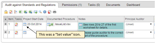
Previously, there were a few different indicators that a cell could be edited. One was a blue icon at the top left of the cell. Another was a black arrow at the right of the cell for certain lists. Examples of both are shown in the screen shot below.

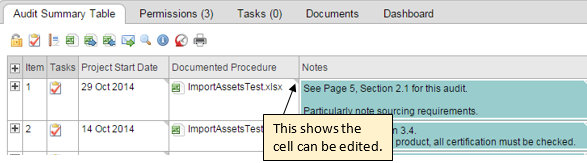
Now the various edit icons have all been replaced by a small grey triangle in the top right corner of the cell. Please compare the screen shots above and below.
The new user interface has a small grey triangle with white edges if there is a colour background. Examples of cells with and without colour can be seen below.
How do I edit the contents of a cell?
Previously you had to click on the symbol to start editing, now (in most cases) you can simply click anywhere in the cell to begin. (The exceptions are dealt with later.) For many responses, an edit box will appear. See the example below for a text response.
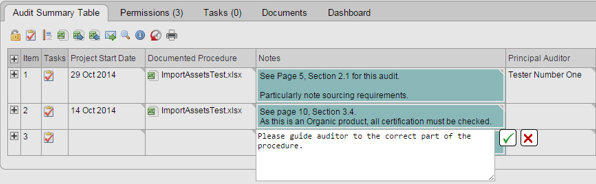
You can enter text, edit any existing text or delete existing text, as before. Clicking on the green tick to the right of the edit box will commit your changes to the Form. Clicking on the red cross will quit editing without change.
In the case of a value field, or drop-down lists, you can also commit changes by hitting the return key on your keyboard. This doesn’t work for a text field because it gives you a carriage return instead.
Date responses have changed more as you can choose to select from a calendar, or type in a date. The date can be in the format ‘DD Mmm YYYY’ or ‘DD/MM/YY’ or other variants. As the user interface resolves the date, it will display the appropriate month in calendar form. Please see below.
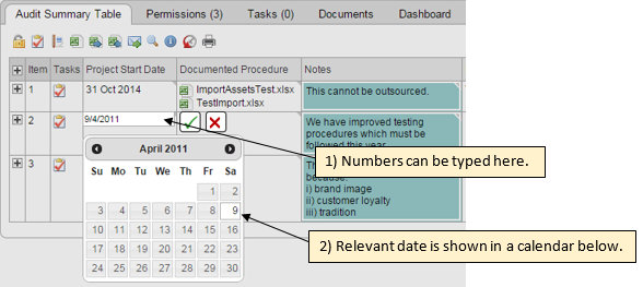
Clicking on the return button or a date in the calendar will commit the changes. If the text entered in the box cannot be resolved as a date, and the user presses the return key anyway, the current date will be put in.
Some response types have changed less. The way in which you edit an evidence response has not been affected in this set of changes, only the click to get started has changed.
Why have these changes been introduced?
One benefit of the new user interface is that there is less visual content in the cell, so the genuine input, or lack thereof, shows up more clearly.
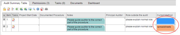
Colour backgrounds also work better with drop down lists in the new interface. In the old interface there was always a white background to the text. Compare the rightmost column in the two screen shots below.
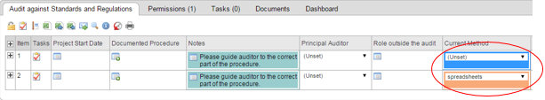
By comparison, the whole cell is coloured in the new interface.
In the case of dates, you need fewer clicks to enter a date. In the old interface you needed a minimum of five clicks, possibly many more if you had to scroll through the calendar. Two pop-up boxes were also required and that could require some extra scrolling if the date cell was near the edge of a window. Now, a date can be entered with just two clicks and, by typing a date, it is no longer necessary to scroll through many monthly calendars to select a date from past or future years.
What are the exceptions to the “click anywhere to edit” rule?
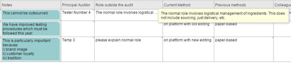
Although we stated earlier that you can click anywhere in the cell to begin editing, this is not true in some cases. For example, if the cell already has content which is too large for the cell, the content will end with an ellipsis (…) and clicking in the right place will show you the missing content, rather than giving you the option to edit it. When hovering the cursor over the right hand side of a cell with too much content to display, the grey triangle turns to a grey ellipsis as shown below.
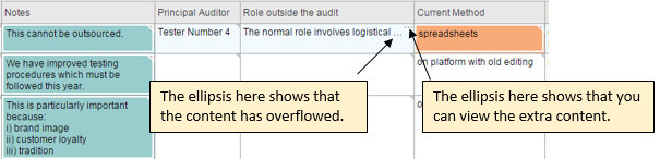
Clicking on the grey ellipsis in the top right corner of the cell gives a yellow pop-up box with the cell’s content. See below for an example.
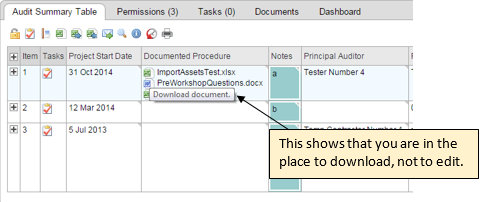
Nor is it true that you can click anywhere in an evidence field to edit, as clicking on the file symbols will allow you to download the individual files rather than edit the selection.
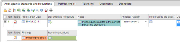
The other exception is fields with references, as clicking on the words drawn down from the other table or form will work as a click-through to that table or form. Reference content is shown in blue font and when you are in the right place to click-through, the font is underlined as shown below. See below. If you want to edit the references you have to move the cursor to another part of the cell.

Another point to note
While you are editing one cell, the rest of the sheet is “greyed out”. You have to finish editing the current cell before you can do anything else on the Form.
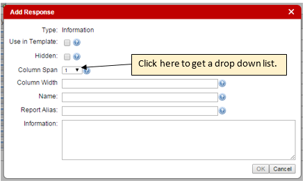
2) Column Spans
This change is one which may alter the appearance of some Forms, but does not change how users add content to forms.
The users most affected by this change are administrators who use the “Designer” tab in the platform.
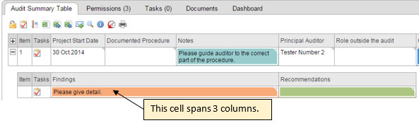
It is now possible to make cells in one row span several columns in another row. This may help with the aesthetics of a Form. Please compare the old interface with the new, as shown in the two screen shots below.
To adjust the column span of a cell, there is a simple drop down list of spans. The default setting is a span of 1, but it is easily adjusted. Simply click on the black arrow and then on the number of columns to span. See below.
3) Column Widths
This is another change which may alter the appearance of some forms, but does not change how users add content to Forms.
The users who may be affected by this change are administrators who use the “Designer” tab in the platform.
Previously the width of columns was set by a mixture of factors including the column name, the length of text strings, and enforced carriage returns at 40 characters. If the text entered into a cell was longer than the column’s name, the cell could expand. This gave the appearance of the cells jumping around on the screen. By setting column widths, this can be avoided.
Changes made to columns’ width specifications in Form Templates are automatically applied to the corresponding Forms when they are next viewed.
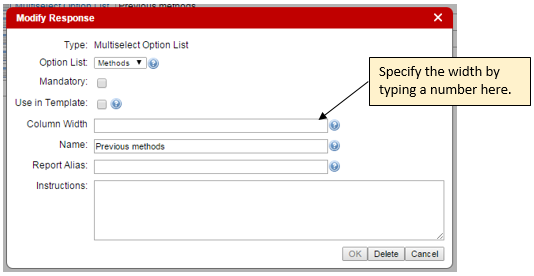
Note that if the name of the column is longer than the width specified, the full name will show but the contents of the cell will wrap at the specified width.
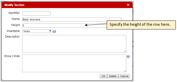
4) Row Heights
The final change which can alter the appearance of a form, but does not affect how users edit the content of a Form is the row height. This is a feature for administrators who use the “Designer” tab in the platform.
Previously, a row’s height would expand as much as necessary to fit in text. Now a row’s height can be limited. The height is specified in the Section. See the screen shot below showing the “Modify Section” box. Heights are specified in characters. These do not apply to evidence or multiple-select reference fields where all content is shown. Truncated text will end will display an ellipsis (…) instead of the grey triangle when the cursor is over the right hand side of the cell.
Changes made to a row’s height specification in a Form Template are automatically applied to the corresponding Form(s) when they are next viewed.